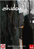
This is my own personal design for our production, 'Shadow'.
I have used macromedia fireworks to create this poster, using a screenshot from the uploaded rough version of our production on youtube for the base photo. I felt it would be best to use an already existing photo instead of creating a new one from scratch as scenes from our film already captured the features we would look for in a poster that we could extract and use, for example to match our genre the majority of colours in the image are darker.
In the central image, I also made use of an effect using macromedia fireworks to put a slight glowing outline around the person visible in shot so that they stood out a little bit more and represented theyre identity in the film as a antagonist to the main character, also singling out the character. I also greyscaled the background to give the shot a more dark, moody feel which fitted out genre and the situation in shot. Also in the central image clearly visible is the main prop, the necklace the character in shot leaves on the tree for the unsuspecting ruby fox. I decided to use this in the poster as being the main prop and playing a major part in the film i thought it would be a good idea to show our audience it and highlight it's importance.
I used a more old fashioned gothic style text for my title of Shadow to fit the darker moodier tone of the poster and our film, also making the text white so its stands out and contrasts against the darker colours used in the image. I chose to use no tagline in my poster as i thought with the character depicted having no dialogue, no clear motive or any characterization in our film overall anything i may use as it would relate to the character may be unreliable or incorrect.

No comments:
Post a Comment