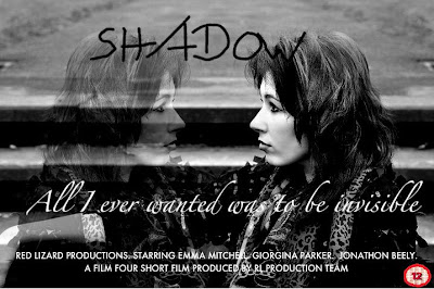
Here is the final design: 

I have included all of the essentials which are needed to advertise the film, such as the tag-line, detailed information about the production team, and cast, and also includes my initial tag-line, and certification. However, I feel that perhaps the certification should be presented in a different colour, as presented on many other film posters, as the red stands out against the black and white theme of the poster. The replicated photograph, combined with the faded effect, is really effective in showing the invisibility which is presented in the narrative of the film, and the photograph also looks professionally created, rather than an amateur film. I didn't include the red lizard production logo, as I believe it is not needed on the poster, as the production team is already presented, but also it stands out too much from the poster, and pulls the focus away from the main image. Overall, I am pleased with my final design, as it is efficient in portraying the narrative of "Shadow", through the use of an image and text.

No comments:
Post a Comment