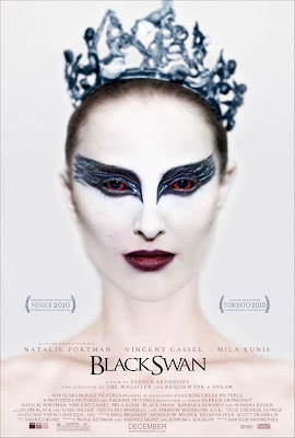
Black Swan is a 2010 American psychological thriller film directed by Darren Aronofsky and distributed by Fox Searchlight pictures. It is a successful film, costing only $13million to produce and by the end of February 2011 the box office gross was over $100million. One of the main reasons why this film did so well, and is still doing so well is the advertising campaign, the use of the posters, adverts and trailers, all in which are extremely effective. This particular poster is the most iconic poster of the film it was used in the majority of adverts including cinema posters, bus stops and billboard
 The focal point of the poster or the most eye catching part of the poster is the girl’s eyes and eye makeup. The eye makeup of the girl is big and bold, because the design around her eyes is black, this contrasts with the rest of her face as she is all white, so the fact her eyes are black suggests that there is a dark side to her, also the shape of the design is like swans wings, another suggestion that the film has something to do with “Black Swans”. Also if you look a bit closer , and look into her eyes, you see that they are red, normally red eyes suggests someone evil or dark, so this further suggests that this girl isn't all good, or that something is going to happen to this girl. The rest of the image seems to be blurry, making it harder to look at forcing your eyes look straight to the girl’s eyes.

The whole image on the poster is of the main character in the film, thefact her face is painted in white suggests purity of this character. However like previously said her eyes are black, suggesting that she’s not as ‘pure’ as first thought, but also her lips are dark purple, also suggesting that this character has a darker/ deeper side to her. In the picture, the girl has her hair tied back in what looks like a tight bun, with a crown on her head; this suggests that she could be in a dance/ballet performance of something to do with royalty.
The background of the poster is white, this suggest purity and goodness, which again is contradicted by the darkness on the girls makeup.

The writing “Black Swan” is black and elegant, this suggests that it could be a film that seems to be about ballet, or another type of classic dance. However, the rest of the writing is pale purples, this contrasts with the black writing, but again makes the again makes the poster have a elegant, purity theme about it.
 On the poster, it has the awards it has won already on it, this shows that audiences already like it,so may make other people go see it. It also has on the names of the main starring roles in it, these names are already popular movie stars adding to the selling point as fans of these stars will go see it. Also on the poster it has the month it is coming out on, so audiences know when they can go see it.

No comments:
Post a Comment