1)In what ways does the media products use, develop or challenge forms and conventions of real Mediaa products?
When filming continuity is a major factor enabling a film to be believable to an audience
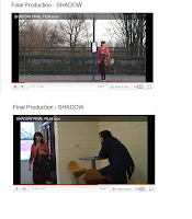 and so it would make sense to them. So with this in mind we kept a conscious watch on anything that could break the continuity in the film. However, throughout filming we found that minor problems occurred which broke the continuity, mainly things like props broke the continuity, for example, at the beginning of the film you will see the main character with a brown bag, however later on she has a black bag, this is due to the fact that half way through filming the original brown bag broke so we had to find another bag in time for filming. Throughout our film we have kept to the 180 degree rule, making sure that even when re filming or editing we did not change the 180 degree shot. Also we used different shots used in media productions; these are eye line match, graphic match.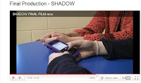
We did this by adding a well known issue today, bullying, this would make some of the audience identify with the character as many people have suffered bullying. However we also wanted to entertain the audience so added in interesting plot twists. Overall I feel that out film is entertaining for the audiences whilst keeping in track with the conventions of our genre.
The overall objective for our main product was to have created a realistic and effective short film that would entertain and attract audiences. Whilst doing this we wanted to relate the film to a popular issue that is big in the country at the minute, bullying. We wanted to create the message that even though you are getting bullied; going invisible or hiding isn't always the best solution to the problem and you should confront your problems not shy away from them.We also kept onto this theme throughout the different media texts we created. On our poster we used the tag line of “All she ever wanted was to be invisible”. We also used this line in our radio trailer, in a whisper. Another tag line we used in our radio trailer was “Sometimes your biggest wish could become your worst nightmare” this relates to the popular saying “Be careful what you wish for”. All of these sayings again help us portray across to the audience that wanting to be invisible or to disappear isn't going to really help or solve your problems, no matter what they are. However whilst wanting to get across this message we also wanted both the radio
trailer and poster to be realistic and believable. To do this we looked at what real radio trailers and real film posters included and adopted them into our own.
In our poster we included; Title, Age certificate, Tag line, extra
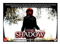 information, Image. All of which are included in all of existing film posters.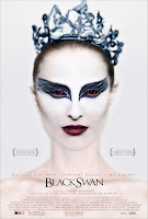
In our radio trailer we included; Information quotes from the film, music. All of which are included in all existing radio trailers.
Our Radio Trailer:
Existing Radio Trailer:
When we 1st started to think of ideas for our film we handed out a questionnaire to people in our target audience, we then filmed their answers on a Sony HDV camera. By doing this we got a general idea of what our target audience expected in to see in our genre of film and also within the restrictions of our chosen target audience guidance. This further helped on the bits we wanted audience to relate more to like the main character.
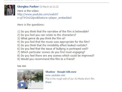
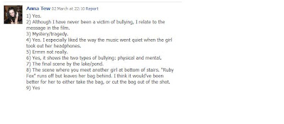
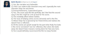
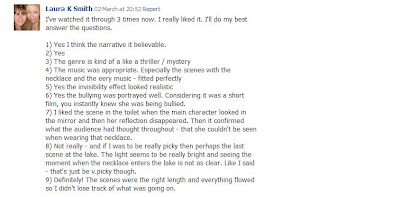
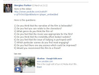
After we had complete our rough edit we did an audience feedback session, recording them again on a Sony HDV camera, we then separately did different audience feed backs, giving us more outcome than if we did just one audience feedback. I used the website www.facebook.com , on this I asked a select few people what they thought of the rough edit and then what they thought could be improved before the final cut. Overall I felt that by getting the thoughts of our target audience helped greatly as it helped us to know if we had made an effective short film that was believable and stuck to the main conventions of our genre, also it helped us to improve any scenes that needed changing.
 4) How did you use new media technologies in the construction and research, planning and evaluation stages?
At the beginning of the project research was a major part of it, researching different aspects of genres of films and different films. For this I used websites such as www.google.com and www.youtube.com
I also used the website www.blogger.com to keep track of the progression of the film making journey. By doing these my research and blogging skills have improved, making me more advanced in these areas, and making it easier in later years if I needed to use either of these again.
 To make our film I used a Sony HDV camera and Tri-pod to film the scenes in the film. By using these I have improved my camera skills and have a better knowledge on how to
 effect film shots to portray messages, also this has helped me greatly to understand how to use the camera efficiently and effectively for future use. The Sony HDV camera is extremely effective when filming on it and easy to use in any location. The only problem the occurred during filming was on one scene at the lake, the white balance was off, so we had to edit it later.
When editing our film, I used Final cut express, on a Mac computer. This programme is very effective and has helped improve my creativity in order to edit our film into a successful final piece. I have improved my editing skills and now know that I can use this programme confidently in the future if ever needed to. After using this programme I understand what different effects do what and how it can make your film more effective
When editing our film, I used Final cut express, on a Mac computer. This programme is very effective and has helped improve my creativity in order to edit our film into a successful final piece. I have improved my editing skills and now know that I can use this programme confidently in the future if ever needed to. After using this programme I understand what different effects do what and how it can make your film more effective
and how certain effects won’t work. In our film the most effective effects include the cross dissolve, speeding a shot up and garage matt. There were hardly any problems that occurred whilst editing our film the only major problem was the Mac computers crashing and work not being saved.
For the final poster we used programme Photoshop to design and create our films poster. I used the tools available to edit the photo for our poster and to insert text and other features of posters. However for my individual poster, I used paint and www.picnik.com to create an effective poster, which would later contribute to our final poster. To create our radio trailer for our film Garage Band was used. We used a zoom recorder to record the sound for our radio trailer and then added it to the software to create an effective radio trailer. I now feel that I am more confident in using these different software, enabling me to confidently use them in the future and not have to worry about not being able to use them.
For the final poster we used programme Photoshop to design and create our films poster. I used the tools available to edit the photo for our poster and to insert text and other features of posters. However for my individual poster, I used paint and www.picnik.com to create an effective poster, which would later contribute to our final poster.
To create our radio trailer for our film Garage Band was used. We used a zoom recorder to record the sound for our radio trailer and then added it to the software to create an effective radio trailer. I now feel that I am more confident in using these different software, enabling me to confidently use them in the future and not have to worry about not being able to use them.Overall I feel that all of the new media technologies I have used have helped to improve my media skills and on the whole have developed my creativity. I feel that any problems I encounter throughout the process I overcame, and made me more confident in using these technologies, and enabled me to create an effective final piece.


 The focal point of the poster or the most eye catching part of the poster is the girl’s eyes and eye makeup. The eye makeup of the girl is big and bold, because the design around her eyes is black, this contrasts with the rest of her face as she is all white, so the fact her eyes are black suggests that there is a dark side to her, also the shape of the design is like swans wings, another suggestion that the film has something to do with “Black

 On the poster, it has the awards it has won already on it, this shows that audiences already like it,so may make other people go see it. It also has on the names of the main starring roles in it, these names are already popular movie stars adding to the selling point as fans of these stars will go see it. Also on the poster it has the month it is coming out on, so audiences know when they can go see it.