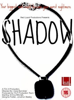
This is my design for a movie poster for our film 'Shadow'. I have used Paint and a programme called Picnic to create it.
Background:
For my main image I have used the main prop in the film, a necklace, as it important throughout the film and as it is on the poster the audience will know that it will play an important part in the film, it also may help any viewer that didn’t understand the use of the prop in the film.
The image of the necklace is in all black, to add the feeling of suspense to it, and also make it seem scarier, also because of this I was able to add a slight shadow to it, which refers to the title of the film. Text:
For the tag line in my poster I used red, this was to make it stand out from the rest, however for my title I used black and white, which makes it look like a shadow, and as it is two toned it not only makes it unique but it makes it stand out on both the background and on the bit of image it covers.
Features:
On my poster I included
Film Four logo – the distributor
15 Certification – the age limit
Director, actors, and Production Company – film information
Tag Line.

No comments:
Post a Comment