Search for posts
Sunday, 27 March 2011
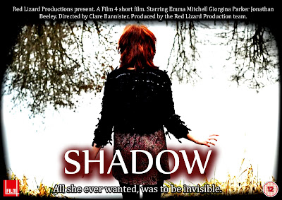
Film Poster - Final Idea 1
Friday, 25 March 2011
Film Poster - My Final Design
Friday, 11 March 2011
Radio analysis
I will be analysing this radio trailer to look at aspects and and features that could be used in our own trailer. I will be analyzing a trailer from the popular psychological thriller film Shutter Island directed by Martin Scorsese and starred in by Leonardo Dicaprio The trailer contains a narrative voiceover, direct quotes from the film and information of the film's cinema release, starring actor and famous director.
The voiceover in this trailer is split between 3 characters, the first voice heard is that of a prison guard welcoming people to shutter island, after that the character Marshall is narrating discussing prisoners and theyre crimes, claiming they are 'all violent offenders, theyre hurt people, murdered them in some cases', also stating 'whatever the hells going on here, its bad'. This sets the mystery element into play using the serious worried tone of his voice. cutting to comments from one of the islands resident psychologist stating 'men of violence are my specialty. This line sparks connotations of the films violent background and also adds the proffesional and psychological element to it.
There is then a high pitched screaming/shrieking sound effect used to invoke fear and more mystery into the trailer, followed by the Leonardo Dicaprio character Marshalls narration 'let me see your face, let me see your damn face' followed by a shout of 'dont move!', also including another shriek at the end of it. As Marshall says each line he raises his voice and his tone gets more and more aggressive, suggesting a sense of urgency as things get more complicated.
The sound of a match being lit is the next sound, followed by a whisper of 'oh my god', suggesting horror and discreteness. Some information of the film is then stated 'Shutter island rated R in theatres febuary 19th', signifying the end of the trailer whilst informing the audience.
The music throughout the whole trailer is quite quiet, deep and dark, with sound effects adding to its effect, it steadily gathers pace getting faster and faster up to the line of 'oh my god' where it then cuts out with the sound of the match being lit. The music overall is minor key, and the music is non diagetic whereas the utterances by Marshall, the prison guard and the psychologist is diagetic as it is all taken directly from the film's audio.
The trailer overall uses its music to match the genre of the film, steadily gathering the musics pace to match the thriller genre, using the audio from the film to add elements of mystery and horror.
Thursday, 10 March 2011
Audience Feedback - Review
1. Canteen Scene
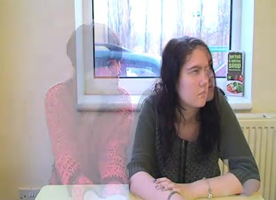
The audience said that up until the canteen scene they would not have known that the character turns invisible. The cross dissolve which we used in effective in realistically showing the audience that she disappears due to the necklace, but it also creative. However, this does not happen until 2 minutes into the film, so perhaps we could shoot another scene, or include the invisiblity effect earlier in the narrative, so that the audience's understanding is curren throughout the film.
2. Corridor Scene
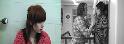
This scene is imperative to the narrative of the film, as it allows the audience to see that the character is being bullied. From the audience feedbackwe found that they found it engaging, and easy to understand. Furthermore, they also felt that they could relate to the character, as bullying is a huge issue in most schools, and the issue was portrayed well. However, after viewing the film back, I feel that some of the shots could be reframed in order to engage the audience further, but also to make the film look neat, to match the continuity.
3. Toilet Scene
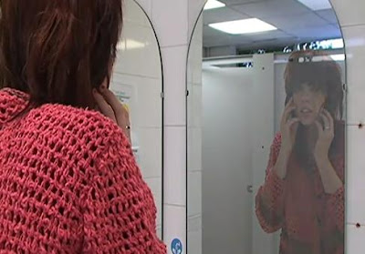
The audience found that this was the most effective scene in the films entirety at showing the invisibility effect. The majoirty of viewers said that they were "shocked" and "suprised" to see the character physically disappearing in the mirror. I am really pleased with the way in which we have edited this scene, as I also personally believe the continuity and effects used,such as the fade, work succesfully. However, I feel that the delay after the character disappears, in mid long shot, should be shortened, as I feel that the continuity could be better.
4. Pond Scene
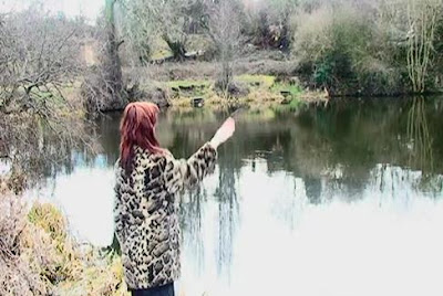
The ending, the audience said, was filmed particularly well, as the location is both eerie, but has a sense of beauty. The desolute area is also effective in isolating the character, and her emotions. The contrast and brightness has been purposely increased in order for the scene to have a mysterious element to it. Also, the over exposure enables the scene to be recognisable in the film. The non-diagetic music also enables the eerie effect to be enhanced, creative tension, and suspense.
Overall, I feel that after a few corrections such as framing, and lighting, the invisibility effect with look realistic, and the characters emotions can be succesfully shown.
Radio Trailer - Analysis
This is a radio trailer for David Tennant’s final episode in BBC1's Doctor who series. It was played on well known radio stations and helped produce a large audience for the final episode. It lasts 38 seconds and contains several common elements of radio trailers, these are;
Quotes from the show
Information of the show (where it’s shown, the times, and the date)
Music
Voiceovers
As soon as the advert the BBC jingle is played with a female voiceover telling you the date the show is been broadcasted “On new year’s day” and the channel it is on “On BBC one”. This straight away tells the audience when it is on, and telling the audience what channel it is on, pulling in more of an audience as they will know when it’s on and audiences that like BBC programmes.
On the advert it continues with quotes from the show, ones that draw in the audience like, “it’s the time lord” this will make the listener want to know what’s happened to him, or what’s going to happen to him. Also by referring to this character by ‘The Time Lord’ it hints at what the show is, and also what genre the show is, and could bring in audience who like the Sci-fi genre, as Doctor who is in the Sci-fi genre.
All throughout the piece non-diegetic music, in minor key, is played, it starts off quiet and low but as the advert continues, it gets louder and more drum beats are included creating more suspense as dramatic quotes are used from the show.
All of the quotes from the show are from male characters and even a few are from the Doctor himself. The female voice over from the beginning, is heard again throughout “The 10th Doctors final chapter” this give the audience some more information about what’s going to happen in the show, but also the line is dramatic and causes suspense, making a listener wanting to find out what happens to him.
As with most radio trailers they end with the main information about the show. The same female voice gives information about where the show can be seen and at what time. The music never stops, getting louder and more intense as the voice over speaks, also in the background there are still quotes from the show, making the ending more dramatic than the rest of the trailer, and this would make the listener want to watch it more, as the show seems to be full of drama and suspense.
Radio's can only project sound to their audiences, so therefore radio trailers have to engross a lot of interesting and captivating sounds. This trailer does this effectively as it uses voices, music and sound effects from the show. These make the trailer more interesting and appealing to listen to and will therefore help produce a larger audience.
Radio Trailer Script Idea
Female voice: Sometimes your biggest wish can be your worst nightmare.
Minor music fades in
Voice 1: “Rubbbbbbyyyyy”
Ruby: “Just leave me alone”
Ruby: “why are you ignoring me?”
Ruby: "How could you do this to me?"
Male Voiceover: A Red Lizard Production, Film 4 presents...SHADOW...Coming to a cinema near you.
Minor music fades out
Wednesday, 9 March 2011
Film Poster Analysis
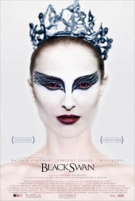
Black Swan is a 2010 American psychological thriller film directed by Darren Aronofsky and distributed by Fox Searchlight pictures. It is a successful film, costing only $13million to produce and by the end of February 2011 the box office gross was over $100million. One of the main reasons why this film did so well, and is still doing so well is the advertising campaign, the use of the posters, adverts and trailers, all in which are extremely effective. This particular poster is the most iconic poster of the film it was used in the majority of adverts including cinema posters, bus stops and billboard
 The focal point of the poster or the most eye catching part of the poster is the girl’s eyes and eye makeup. The eye makeup of the girl is big and bold, because the design around her eyes is black, this contrasts with the rest of her face as she is all white, so the fact her eyes are black suggests that there is a dark side to her, also the shape of the design is like swans wings, another suggestion that the film has something to do with “Black Swans”. Also if you look a bit closer , and look into her eyes, you see that they are red, normally red eyes suggests someone evil or dark, so this further suggests that this girl isn't all good, or that something is going to happen to this girl. The rest of the image seems to be blurry, making it harder to look at forcing your eyes look straight to the girl’s eyes.

The whole image on the poster is of the main character in the film, thefact her face is painted in white suggests purity of this character. However like previously said her eyes are black, suggesting that she’s not as ‘pure’ as first thought, but also her lips are dark purple, also suggesting that this character has a darker/ deeper side to her. In the picture, the girl has her hair tied back in what looks like a tight bun, with a crown on her head; this suggests that she could be in a dance/ballet performance of something to do with royalty.
The background of the poster is white, this suggest purity and goodness, which again is contradicted by the darkness on the girls makeup.

The writing “Black Swan” is black and elegant, this suggests that it could be a film that seems to be about ballet, or another type of classic dance. However, the rest of the writing is pale purples, this contrasts with the black writing, but again makes the again makes the poster have a elegant, purity theme about it.
 On the poster, it has the awards it has won already on it, this shows that audiences already like it,so may make other people go see it. It also has on the names of the main starring roles in it, these names are already popular movie stars adding to the selling point as fans of these stars will go see it. Also on the poster it has the month it is coming out on, so audiences know when they can go see it.
My Poster Design
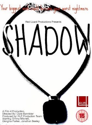
This is my design for a movie poster for our film 'Shadow'. I have used Paint and a programme called Picnic to create it.
Background:
For my main image I have used the main prop in the film, a necklace, as it important throughout the film and as it is on the poster the audience will know that it will play an important part in the film, it also may help any viewer that didn’t understand the use of the prop in the film.
The image of the necklace is in all black, to add the feeling of suspense to it, and also make it seem scarier, also because of this I was able to add a slight shadow to it, which refers to the title of the film. Text:
For the tag line in my poster I used red, this was to make it stand out from the rest, however for my title I used black and white, which makes it look like a shadow, and as it is two toned it not only makes it unique but it makes it stand out on both the background and on the bit of image it covers.
Features:
On my poster I included
Film Four logo – the distributor
15 Certification – the age limit
Director, actors, and Production Company – film information
Tag Line.
Audience Feedback - Results
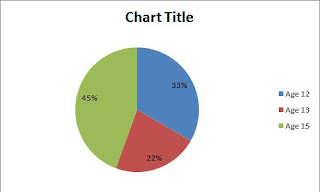
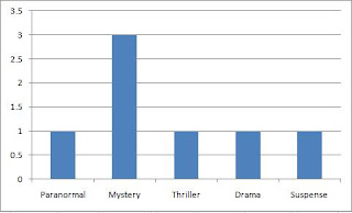
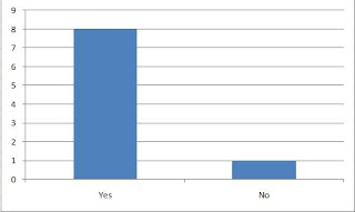
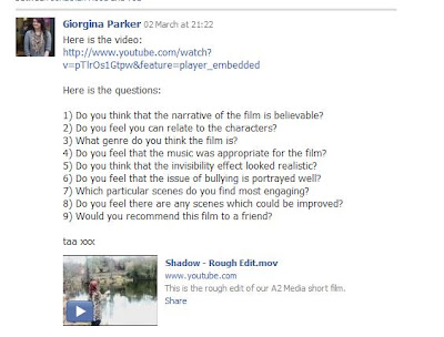
Audience Feedback
Audience Feedback - Part 2
Tuesday, 8 March 2011
Audience Feedback
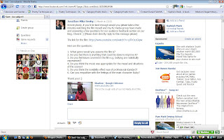
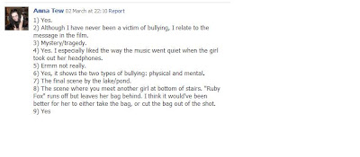
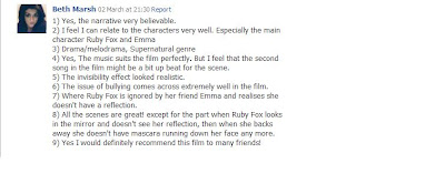
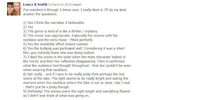
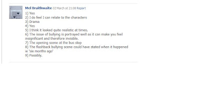
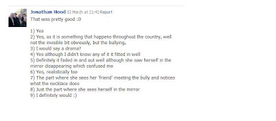
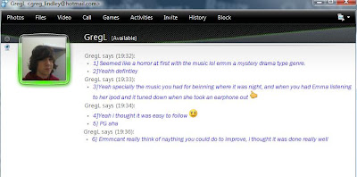
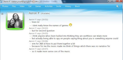
And here are the replys i recieved from willing recipents.
17 year old male.
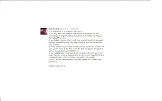
36 year old female.
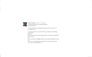
17 year old male.
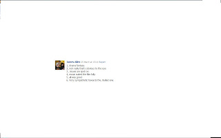
19 year old male.
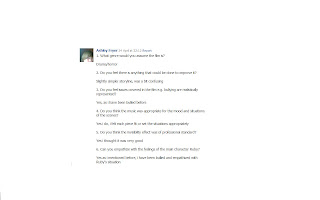
19 year old female
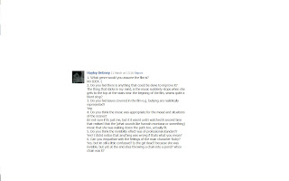
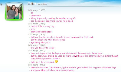
After analysing the results of my questions, I found a number of differing opinions and constrasting statements on certain aspects of our film. People repeatedly expressed empathy for the characters situation as they had been bullied in theyre own lifes, showing we represented the character ideally.
All recipents thought the music was ideal and suited our production fully, one even citing the differences between the minor and major key music we used. 4 correctly assumed that the one of the genre's was Drama, with 2 also thinking it was part fantasy. All recipents thought that the invisibility scene was very good and could not find a problem with it. Overall the comments were generally good and showed flaws and strong points in our production.


Poster Design
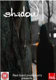
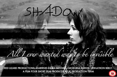
This is my own personal design for our production, 'Shadow'.
I have used macromedia fireworks to create this poster, using a screenshot from the uploaded rough version of our production on youtube for the base photo. I felt it would be best to use an already existing photo instead of creating a new one from scratch as scenes from our film already captured the features we would look for in a poster that we could extract and use, for example to match our genre the majority of colours in the image are darker.
In the central image, I also made use of an effect using macromedia fireworks to put a slight glowing outline around the person visible in shot so that they stood out a little bit more and represented theyre identity in the film as a antagonist to the main character, also singling out the character. I also greyscaled the background to give the shot a more dark, moody feel which fitted out genre and the situation in shot. Also in the central image clearly visible is the main prop, the necklace the character in shot leaves on the tree for the unsuspecting ruby fox. I decided to use this in the poster as being the main prop and playing a major part in the film i thought it would be a good idea to show our audience it and highlight it's importance.
I used a more old fashioned gothic style text for my title of Shadow to fit the darker moodier tone of the poster and our film, also making the text white so its stands out and contrasts against the darker colours used in the image. I chose to use no tagline in my poster as i thought with the character depicted having no dialogue, no clear motive or any characterization in our film overall anything i may use as it would relate to the character may be unreliable or incorrect.
Sunday, 6 March 2011
Audience Feedback - Part Two
RESULTS
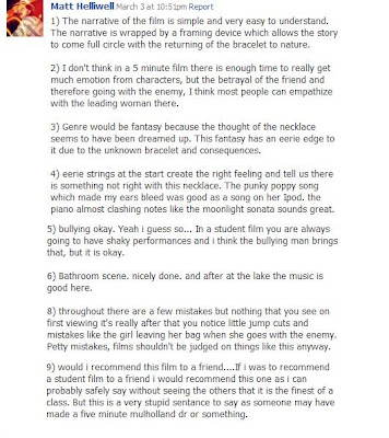
1. MALE (19)
----------------------------------------------------------------------
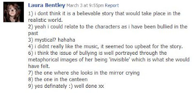
2. FEMALE (17)
--------------------------------------------------------------
---------------------------------------------------------------
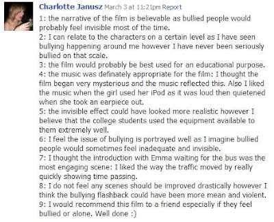
4. FEMALE (18)
--------------------------------------------------------------
5. MALE (18)

---------------------------------------------------------------
6. FEMALE ( 21)
-----------------------------------------------------------------
-----------------------------------------------------------------
9. MALE (17)
---------------------------------------------------------------
10. FEMALE (18)
----------------------------------------------------------------
11. MALE (17)
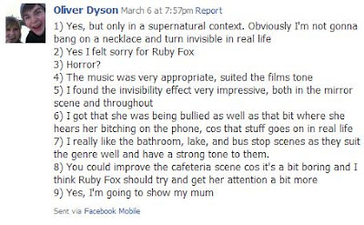
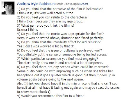
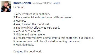
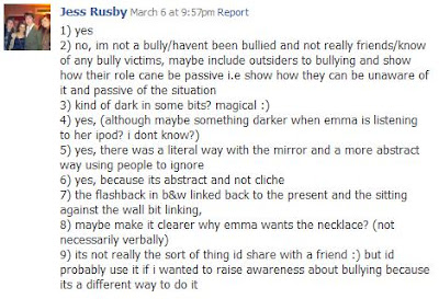
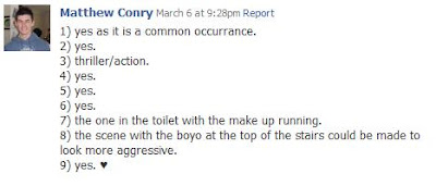
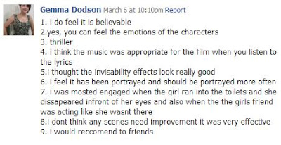
CONCLUSION: From the results, I have found that all of the viewers enjoyed the film, as they would recommend it to other friends. Word of mouth is a highly popular form of advertising, and therefore my questionnaire was successful in engaging a popular audience. The majority of viewers said that the canteen scene could be improved, as it doesn't consist of much action, and the dimply lit lighting does not help. The conversation also consisted in the scene could also be improved, perhaps developed to something more engaging, and audience satisfying, such as an argument, to enhance the action. However, the scenes which most viewers found enjoyable were the invisibility scenes; particularly the mirror scene, and the scene in which she disappears next to her friend. This is pleasing for us as a production team, as it shows us that we have succeeded in creating the invisibility effect well, and it looks realistic, enabling the narrative of the film to be understandable. Overall, I am pleased with the audience feedback, and we will take these into consideration, whilst further developing our film.
Tag-Line
Friday, 4 March 2011
Poster Design - Creation
Although Photobucket works well creating a basic poster design, I feel that it is imperative that we use Photoshop as the final programme which we create the poster on, as we are able to create the poster with greater detail, and precision.
Thursday, 3 March 2011
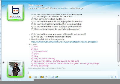
Audience Feedback
WINDOWS LIVE MESSENGER
