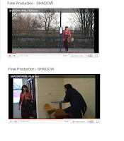
Search for posts

Tuesday, 26 April 2011

Critical Evaluation

1: In what ways does the media product use, develop or challenge forms and conventions of real media products?


Continuity is a majorly important convention to uphold, maintaining a solid concept of plot and character continuity is considered vital in modern day film. Whilst filming our production, we took careful observations to try and maintain a strong consistent level of continuity and avoid possible suspension of disbelief. Even with careful planning our continuity was not perfect, but any errors made were indistinguishable unless you were looking specifically for continuity errors, for instance a continuity error is the colour of Ruby’s bag which changes, as the original brown bag broke during filming, and we could only replace it with a black one on the day of filming.


Based on research into the generic conventions of a thriller film, our film’s main genre would be classified as a thriller due to our utilizing of generic conventions. A thriller films aim is to get the audience’s attention and keep them wanting more, we used a convention called a plot twist in our film to try and create this desired effect. A second generic convention of a thriller film we used was minor key music, which is often used in order to add to the suspense, mystery and overall atmosphere of the film. I believe our film fulfils the nature of the genre, we made no aim to deliberately subvert any expectations and we did not.


We did not deliberately use any elements of pastiche or parody in our production, our idea was completely original and drafted from a treatment made at the beginning of the term and our research into the thriller genre. Aspects of our film however could be seen to use elements of pastiche, for example our invisibility effect used could be considered pastiche of other thriller films using invisibility effects such as science fiction thriller Hollow Man.


The audience pleasure we were trying to achieve was based on Richard Dyers theory of entertainment, the aspect of intensity and the extremes of emotion’s invoked by the plight of Ruby Fox as she tries to regain her visibility and identity as well as coping with bullying. Our audience feedback showed we gained this aspect of intensity as a number of people spoke about how they related to the character through bullying after themselves being bullied in the past.


2: How effective is the combination of your main product and ancillary texts?


The main achievement we sought to obtain was to make our production a good short film, with a solid plot and storyline that would make people want to watch it and would invoke emotion into our audience using the bullying concept in our film. We wanted to broadcast a message through our production that said running away from a problem, or in Ruby Fox’s case turning invisible, isn’t a solution. We referred back to this in both our radio trailer and poster design. On the poster we utilized the tag line “All she ever wanted was to be invisible”, which refers to Ruby’s plight. In our radio trailer we also used this tagline to dramatic effect, using the voice of Ruby’s actor to whisper it in a chilling fashion. A second tagline we used in the radio trailer is “Sometimes your biggest wish could become your worst nightmare”, another referral to Ruby’s plight, and displaying her false judgment, that even though she in-avertedly ran away from her problems, it has only caused them to now worsen. The 2 taglines both help broadcast the message our production is trying to put across to our audience regarding bullying.


Radio Trailer Link


http://youtu.be/mFlHBuG5hos


3: What have you learned from your audience feedback?


Our initial step in gathering information for audience feedback was to create a questionnaire consisting of 9 questions, asking for answers rangin


g on subjects including the narrative of our film, the portrayal of bullying and improvements that could be made. We then let our prospective audience watch a rough edit of our production so they could answer the questionnaire; w


e filmed these answers using a Sony HDV 1000 camera and tripod. This helped us garner a concept of what our audience wanted to see, shows that we used genre conventions correctly and matched our set genre as well as how good they thought our film is overall.


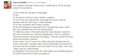
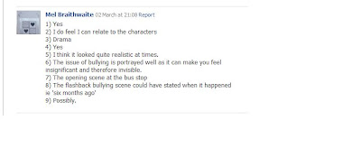
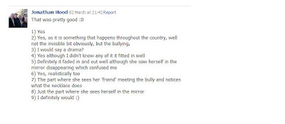
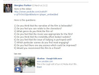
After gathering feedback using this method, our group then separately conducted audience feedback sessions using social networking site http://www.facebook.com/. I constructed a template message which I sent to people asking them to kindly take the time to watch our rough edit which a link to was included and answer 6 questions on the film. This feedback gathered helped us to decide what the key things to strengthen were in the final cut of our production. With the assistance of audience feedback overall I think we made our film realistically believable and well adapted within the conventions of our chosen genre.


4: How did you use new me


dia technologies in the construction and research, planning and evaluation stages?


In the initial stages of starting blog work, one of the new technologies to adapt to using was the iMac interface and operating system, as primarily I have been a user of Windows and Linux operating systems and interfaces at home, school and college. Some of the new things I had to adapt to were new keyboard shortcuts, as I am quite adept using them on windows systems however they aren’t always strictly the same on iMac. Another feature to adapt to is the lack of a start bar, which is a pivotal feature of windo


ws systems and a very unusual change to a regular user, as apart from desktop shortcuts it is where you would access all of your programs, documents and other forms of files from.


For research, I usedvarious search engines such as http://www.google.com/, www.imdb.com and http://www.wikipedia.com/ to research films, film genres, generic conventions, distributors and various other things. I also made use of the site http://www.blogger.com/ to keep an online textual and multimedia log of our work. I felt using a blogging site helped improve my blogging skills immensely as I had no previous experience of blogging, giving me a skill that could be very useful for the future.


To create our film, we used a Sony HDV 1000 camera and tri-pod. Using the HDV was a massive change from using the smaller handheld cameras, it gives a massive improvement in terms of visual quality moving from what felt like an amateur quality to a more professional quality, however manoeuvrability is impaired due to the HDV being around 4 times the size of a handheld camera. The range of shots we could confidently use was improved using the HDV, as the lower quality of the handheld cameras previously used was an issue when it came to smaller more concise details we wanted noticing, or longer shots as again smaller details that are in the distance are harder to make out. Another strength of the HDV was the sound capturing quality it provided, which was a great deal clearer than the handheld cameras.


To edit our production we made use of exclusive apple iMac application software, a non linear video editing piece called Final Cut Express, which is designed for the purpose of advanced editing of digital and high definition video. It is used by amateurs and professional videographers and media personnel alike.


Using this software helped increase my creative skills and my understanding of editing film, including the different tools used in the software for instance transitional effects and the many methods of editing. The professional standard stood out compared to other video editing software I have used, for instance windows movie maker, offering more complexity and finer more detailed editing, further showing an increase in my skills.


For the final poster design, we used graphic image manipulation software package Adobe Photoshop, a very commonly used and high standard piece of software, well known for its user friendly tools. We used this program to insert text, images such as distributors and age certification logo, resize and cut our image, use tools to change the contrast and various other things.


For my own poster design however, I chose to use Adobe Fireworks, which I had previously used to create animated graphics for web design and other various tasks such as creating radio buttons and image optimization. I chose to use this programme as I had used it before to create simple images or animations, but I wanted to see how I could edit and manipulate images using the programme. Using Fireworks, I took a screenshot from our film and used various effects such as grey scaling the image to make the atmosphere more dark and moody to suit our genre. This further developed my skills using a piece of software I was already familiar with but using tools and features I had never been required to utilize before.


For the radio trailer, we used a piece of equipment I had never heard of before called a zoom recorder to record our scripted lines in a sound proofed room. We then imported the recording onto an iMac and used a piece of application software called Garageband to edit the required pieces of sound from the recording. I had no previous experience using this software however after doing some research using a search engine I discovered how to do so. This improved my skills using this particular piece of software, and my researching skills using the internet as I had to filter through a lot of websites containing non-essential search results.


Overall, I feel that new media technologies have helped improve my creativity as a whole, helping me develop new skills in sound recording and image manipulation, and further develop skills in filming, editing film, using unfamiliar operating system interfaces, conducting research using the internet and blogging skills. We have created various pieces of work to professional standards and an end product of undoubted quality using our developed skills and creativity.

Monday, 25 April 2011

Critical Evaluation


1)In what ways does the media products use, develop or challenge forms and conventions of real Mediaa products?

When filming continuity is a major factor enabling a film to be believable to an audience
and so it would make sense to them. So with this in mind we kept a conscious watch on anything that could break the continuity in the film. However, throughout filming we found that minor problems occurred which broke the continuity, mainly things like props broke the continuity, for example, at the beginning of the film you will see the main character with a brown bag, however later on she has a black bag, this is due to the fact that half way through filming the original brown bag broke so we had to find another bag in time for filming. Throughout our film we have kept to the 180 degree rule, making sure that even when re filming or editing we did not change the 180 degree shot. Also we used different shots used in media productions; these are eye line match, graphic match.
Our film would be classed as a thriller mainly because we used several of the known conventions of the genre thriller; some of these are Minor Music, Plot twist and damsel in distress.Minor music is used to create suspense and a dramatic atmosphere for the audience; we use this in the 1st and last scene, both which are important scenes as it’s the finding and getting rid of the necklace scenes. Plot twists are used to keep the audience’s attention throughout the film, which creates more suspense for the audience.Damsels in distress are normally the main character needing rescuing, our film is no different, and our main character is getting bullied and has been put in a bad situation with the necklace.Also because of the couple of audience feedback sessions I undertook. The idea for our film is completely original, there are of course certain aspects that are used in different films such as the invisibility effect that is used most famously in Harry Potter, however the idea of it being a necklace and the events that happen in the film are original, the ideas coming from what we as a group knew about the genre and film conventions. Our main goal throughout making our film was that the audience would get entertainment throughout the film but also to identify slightly with the characters.
We did this by adding a well known issue today, bullying, this would make some of the audience identify with the character as many people have suffered bullying. However we also wanted to entertain the audience so added in interesting plot twists. Overall I feel that out film is entertaining for the audiences whilst keeping in track with the conventions of our genre.

2) How effective is the combination of your main product and ancillary texts?

The overall objective for our main product was to have created a realistic and effective short film that would entertain and attract audiences. Whilst doing this we wanted to relate the film to a popular issue that is big in the country at the minute, bullying. We wanted to create the message that even though you are getting bullied; going invisible or hiding isn't always the best solution to the problem and you should confront your problems not shy away from them.We also kept onto this theme throughout the different media texts we created. On our poster we used the tag line of “All she ever wanted was to be invisible”. We also used this line in our radio trailer, in a whisper. Another tag line we used in our radio trailer was “Sometimes your biggest wish could become your worst nightmare” this relates to the popular saying “Be careful what you wish for”. All of these sayings again help us portray across to the audience that wanting to be invisible or to disappear isn't going to really help or solve your problems, no matter what they are. However whilst wanting to get across this message we also wanted both the radio
trailer and poster to be realistic and believable. To do this we looked at what real radio trailers and real film posters included and adopted them into our own.
In our poster we included; Title, Age certificate, Tag line, extra
information, Image. All of which are included in all of existing film posters.


In our radio trailer we included; Information quotes from the film, music. All of which are included in all existing radio trailers.
Our Radio Trailer:
Existing Radio Trailer:


3) What have you learned from your audience feedback?

When we 1st started to think of ideas for our film we handed out a questionnaire to people in our target audience, we then filmed their answers on a Sony HDV camera. By doing this we got a general idea of what our target audience expected in to see in our genre of film and also within the restrictions of our chosen target audience guidance. This further helped on the bits we wanted audience to relate more to like the main character.
After we had complete our rough edit we did an audience feedback session, recording them again on a Sony HDV camera, we then separately did different audience feed backs, giving us more outcome than if we did just one audience feedback. I used the website www.facebook.com , on this I asked a select few people what they thought of the rough edit and then what they thought could be improved before the final cut. Overall I felt that by getting the thoughts of our target audience helped greatly as it helped us to know if we had made an effective short film that was believable and stuck to the main conventions of our genre, also it helped us to improve any scenes that needed changing.
4) How did you use new media technologies in the construction and research, planning and evaluation stages?
At the beginning of the project research was a major part of it, researching different aspects of genres of films and different films. For this I used websites such as www.google.com and www.youtube.com
I also used the website www.blogger.com to keep track of the progression of the film making journey. By doing these my research and blogging skills have improved, making me more advanced in these areas, and making it easier in later years if I needed to use either of these again.
To make our film I used a Sony HDV camera and Tri-pod to film the scenes in the film. By using these I have improved my camera skills and have a better knowledge on how to
effect film shots to portray messages, also this has helped me greatly to understand how to use the camera efficiently and effectively for future use. The Sony HDV camera is extremely effective when filming on it and easy to use in any location. The only problem the occurred during filming was on one scene at the lake, the white balance was off, so we had to edit it later.

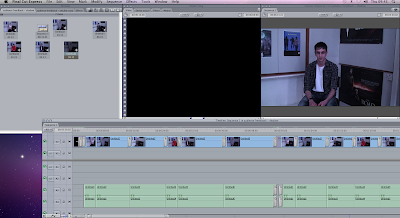
When editing our film, I used Final cut express, on a Mac computer. This programme is very effective and has helped improve my creativity in order to edit our film into a successful final piece. I have improved my editing skills and now know that I can use this programme confidently in the future if ever needed to. After using this programme I understand what different effects do what and how it can make your film more effective
and how certain effects won’t work. In our film the most effective effects include the cross dissolve, speeding a shot up and garage matt. There were hardly any problems that occurred whilst editing our film the only major problem was the Mac computers crashing and work not being saved.

For the final poster we used programme Photoshop to design and create our films poster. I used the tools available to edit the photo for our poster and to insert text and other features of posters. However for my individual poster, I used paint and www.picnik.com to create an effective poster, which would later contribute to our final poster.To create our radio trailer for our film Garage Band was used. We used a zoom recorder to record the sound for our radio trailer and then added it to the software to create an effective radio trailer. I now feel that I am more confident in using these different software, enabling me to confidently use them in the future and not have to worry about not being able to use them.
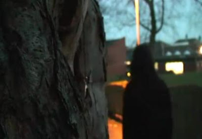
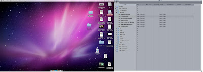
Overall I feel that all of the new media technologies I have used have helped to improve my media skills and on the whole have developed my creativity. I feel that any problems I encounter throughout the process I overcame, and made me more confident in using these technologies, and enabled me to create an effective final piece.

Friday, 22 April 2011

Critical Evaluation - Question Four

4. How did you use new media technologies in the construction and research, planning and evaluation stages?

CONSTRUCTION
Digital technology was particularly imperative to use during the construction stage, as the use of digital equipment was particularly high. We filmed “Shadow” using Sony HDV 1000 cameras with a Sony HDV 1000 tripod, to ensure a higher quality visual element, and to make certain that the shots were filmed smoothly, to make the film as realistic as possible; even the hand held shots were filmed with a certain precision so that the camera didn’t shake too much. We did this by filming the handheld scene slowly, so that the camera operator could walk as slowly as possible, in order to track the character gently. The speed was then increased through the editing process to the normal pace, to make the scene the accurate speed.


The editing process was created on an Apple Mac computer, and completed through the software Final Cut Express; here we were able to use fades, cuts and dissolves to create the film with excellent continuity. We transferred the scenes from the camera to the Apple Mac using a zoom recorder. This was a simple software to use, and was efficient in quickly converting the scenes onto the program Final Cut Express.


INVISIBILITY
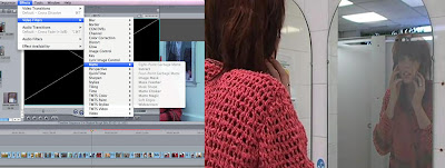
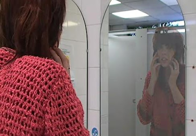
As our invisibility effect was quite difficult to portray, our research from the internet came in very useful. We first of all used the garbage matt effect to successfully make the protagonist’s reflection disappear, with the character still visible in the frame, to give the effect of invisibility. In order to widen our creativity with the invisibility effect, we also decided to use a ripple dissolve effect on the protagonist, during the canteen scene, in order for the audience to view a range of ways in which the character is portrayed as invisible, ensuring the film isn’t repetitive with the special effects which we use.


Not only was the Sony HDV 1000 camera used to film our production, but it was also used during the audience feedback, to record the target audience’s responses. This came in useful, as it was an efficient way to capture, and combine the responses together, again cutting them together through the use of Final Cut Express.


This software provided us with the tools and ability to create a professional looking short film. The software was quite difficult to understand whilst trying to resurrect the invisibility effect, but any problems were overcome by seeking technical support on search engines such as Google and by watching YouTube videos.

RADIO TRAILER: In order to construct our radio trailer, we used a zoom recorder, to record our voices in a sounds proof room, in order for our voices to sound effective, particularly the whispers, and then uploaded the recordings onto the Mac computer, through the software garage band. At first this was difficult to use, as I have no previous experience using the program, but this problem was immediately overcome, through the use of research on the internet, again using the search engine Google.

POSTER: We created this though the software Photoshop, which is an extremely effective program to use, as it allowed us to be precise in the cuts and re-sizing of the photo. The contrast was easily increased, and we added text in various different fonts, with the certification which we had previously given, to ensure that the poster looked professional and realistic, and also make certain that it denoted the genre through the use of colour, image, and text.
This is the poster which I created using the programme photobucket:


Please click on slideshow to view larger screen


The convergence of a 3.2MP camera, with the Blackberry Curve mobile phone, to create this new media technology meant that I could take quality photographs and upload them straight to the internet using my mobile phone. This played an important part during the process of creating a poster, as it allowed me to quickly and efficiently upload the photos onto the internet, without any problems.
This process has helped me to learn about the fast paced nature of the media industry from recording to editing and to the final product as this whole process only took about an hour and a half.

PlANNING
In order for us to even begin to think about creating a film, it was imperative that we first created various different treatments, to expand our ideas, and create an idea that would be successful to use in a 5 minute film. Research from the internet, on the search engine Google came in specifically useful during the planning process, and it allowed me to research previous treatments, which had worked efficiently.

GOOGLE


• Conventions of a thriller film
http://www.slideshare.net/Cissnei/conventions-of-thriller-films-and-tables-of-analysis
• Certification
http://www.bbfc.co.uk/
• Distribution
http://www.film4.com/features/article/online-movie-distribution
• The invisibility Effect
http://abcnews.go.com/WNT/story?id=130424&page=1
• Costume
http://www.google.co.uk/images?hl=en&rlz=1G1GGLQ_ENUK367&q=extravagant%20costume%20designs&um=1&ie=UTF-8&source=og&sa=N&tab=wi
• Music
http://www.google.co.uk/search?hl=en&rlz=1G1GGLQ_ENUK367&tbm=vid&q=thriller+genre+film+music&aq=f&aqi=&aql=&oq=
• Narrative Theories
http://en.wikipedia.org/wiki/Narratology
• Existing Short Film
http://www.bbc.co.uk/filmnetwork/
• Existing Film Poser
http://www.google.co.uk/images?hl=en&rlz=1G1GGLQ_ENUK367&q=inception%20film%20posters&um=1&ie=UTF-8&source=og&sa=N&tab=wi
• Existing Radio Trailer
http://www.youtube.com/results?search_query=teaser+trailers&aq=f


Not only was the search engine Google useful, but the website Photobucket, was useful to create the costume videos which featured the actors in their costumes, but was also used to create the initial poster design, and used to create slideshows of thriller genre research. Photo bucket allowed me to easily edit the contrast, and brightness of the images, in order for them to stand out against the page.
At the feedback stage we also tried to get people’s opinions from social networking websites. I uploaded the first cut of our product to YouTube and then posted a link on the social networking website Facebook where my friends were able to leave comments. As well as this I also posted a link to the video on another social networking site, Windows Messenger, where people left me replies with their comments on the video.
We collaborated and shared our ideas at the planning stage using online blogs. I used the popular blogging service Blogger, as it allowed me to share pictures, video and other media quickly in a neatly presented manor. This meant that whenever I was inspired be something, no matter where I was, I was able to share this inspiration with the rest of my team.
Overall new media technologies helped us to create a professional piece at a fraction of the cost and time that it would have otherwise taken. Everything from using the photo editing software Photoshop when designing our poster, to distributing media on Facebook helped us to be more efficient.

Critical Evalutation - Question Three

What have you learned from your audience feedback?


Please click to view large image.


LINKS (please click on each to view):
Video Feedback
Audience Feedback

Critical Evaluation - Question Two


This is an audio video, please ensure volume is not muted.

COMPARISONS
Poster: (please click to view larger image)


Radio Trailer: (please click to open links)
Existing Radio Trailer - 500 Days Days of Summer
Our Radio Trailer - Shadow

Critical Evaluation - Question One

Shadow presentation

Please click to view slides.

Sunday, 10 April 2011

Critical Evaluation - Question 4


(The text below is all of the information included in the video)

4- How did you use new media technologies in the construction and research, planning and evaluation stages?

During the first few weeks of our project I used the internet to research and plan our film. I visited popular sites including www.google.com and www.youtube.com to investigate the starting points of our project. I also used the website www.blogger.com to make a blog that would show the progression of our film. This has helped to improve my research skills and also my blogging skills. It also allowed me to design and create my own online blog.

Whilst blogging about our film I used my digital camera to take photographs for my work, I took all the photos for our photo storyboard, several for the props and a few for locations. By doing this I have improved my photography skills and also my planning skills as the photographs helped to plan out the shots for our film.

In order to actually create our project I used a Sony HDV camera and tri-pod to film the require scenes. I feel that I have improved my filming skills greatly and now have a better knowledge of the different shots that help make an effective piece, including eye-line match, graphic match and other creative shots. I believe that using the Sony HDV camera has helped improve my skills as it a very easy and simple piece of technology to use, that can be used in many different locations and still provide a professional result. The Sony HDV camera was incredibly easy to use and I didn’t really encounter any serious problems, the only one I can recall is that whilst filming the final scene I had great difficulty in white balancing the camera, after several attempts the shot still seemed to bright and therefore I had to film it and re-edit it on the computer. This took up quite a lot of filming and editing time.
I used the programme Final Cut Express on a Mac computer to edit our project. This programme is very effective and has helped enhance my creativity in order to edit our film into a successful final piece. I have definitely improved my editing skills and now have increased confidence with editing; I understand the different effects and edits that can be used on a film as I have used several different ones on our film. These include cross dissolve, speeding up a shot* and garbage matt. I found the garbage matt to be an incredibly valuable effect and used in twice in our project, I feel that without it our film would not have been as successful. I did not have many problems whilst editing our piece, the most common was that the Mac computer kept crashing and I was at a high risk of losing any unsaved editing. Also when re-arranging and adding in new footage I had to keep rendering our project which took up quite a lot of editing time.

I used the editing programme Photoshop 7.0 to design and construct our films poster. I used the tools available to edit the photo for our poster and to insert text and other features of posters. This has helped to improve my design and editing skills as I have now gained experience is film poster design.
In order to create a radio trailer for our film I used Garage Band to put our sound, which was recorded from a zoom recorder, together and to adjust it in order to make a realistic trailer. I used the programme to edit the volume and to arrange the sounds in the correct order. I feel that now my sound recording and editing skills have been enhanced and improved as I have never made a radio trailer before.
Overall I feel that all of the new media technologies I have used have helped to improve my media skills and on the whole have developed my creativity. I believe that I successfully overcame any problems I encountered with the equipment used and that I have created a successful final piece.

Critical Evaluation - Question 3


CLICK TO ENLARGE IMAGES

LINKS

Critical Evaluation - Question 2


Poster Evaluation


NOTES
Link 1 ( Our Radio Trailer):
http://youtu.be/mFlHBuG5hos


Link 2 (Existing Radio Trailer) :
http://youtu.be/NOlq3EVEmlE


CLICK IMAGES TO ENLARGE

Critical Evaluation - Question 1


LINKS
-
Minor Music: http://youtu.be/dmbAuJmr0_8


Note : CLICK IMAGES TO ENLARGE

Sunday, 27 March 2011

Final Poster


Film Poster - Final Idea 1


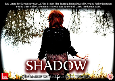
This is my first design for our film poster. It includes all the basic fundamentals for our film including title, tag-line and information about the cast. However after a group Discussion we feel that it doesn't work as well as it could for our film, therefore we are working on a new design.

Friday, 25 March 2011

Film Poster - My Final Design

After sketching an initial design, and completing an example of a poster, I decided to create a poster of our film, which we could possibly edit and use as the final product.
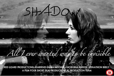
Here is the final design:
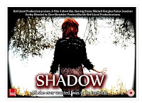
I have included all of the essentials which are needed to advertise the film, such as the tag-line, detailed information about the production team, and cast, and also includes my initial tag-line, and certification. However, I feel that perhaps the certification should be presented in a different colour, as presented on many other film posters, as the red stands out against the black and white theme of the poster. The replicated photograph, combined with the faded effect, is really effective in showing the invisibility which is presented in the narrative of the film, and the photograph also looks professionally created, rather than an amateur film. I didn't include the red lizard production logo, as I believe it is not needed on the poster, as the production team is already presented, but also it stands out too much from the poster, and pulls the focus away from the main image. Overall, I am pleased with my final design, as it is efficient in portraying the narrative of "Shadow", through the use of an image and text.

Friday, 11 March 2011

Radio analysis

http://www.youtube.com/watch?v=FOZW2GzO98g

I will be analysing this radio trailer to look at aspects and and features that could be used in our own trailer. I will be analyzing a trailer from the popular psychological thriller film Shutter Island directed by Martin Scorsese and starred in by Leonardo Dicaprio The trailer contains a narrative voiceover, direct quotes from the film and information of the film's cinema release, starring actor and famous director.

The voiceover in this trailer is split between 3 characters, the first voice heard is that of a prison guard welcoming people to shutter island, after that the character Marshall is narrating discussing prisoners and theyre crimes, claiming they are 'all violent offenders, theyre hurt people, murdered them in some cases', also stating 'whatever the hells going on here, its bad'. This sets the mystery element into play using the serious worried tone of his voice. cutting to comments from one of the islands resident psychologist stating 'men of violence are my specialty. This line sparks connotations of the films violent background and also adds the proffesional and psychological element to it.

There is then a high pitched screaming/shrieking sound effect used to invoke fear and more mystery into the trailer, followed by the Leonardo Dicaprio character Marshalls narration 'let me see your face, let me see your damn face' followed by a shout of 'dont move!', also including another shriek at the end of it. As Marshall says each line he raises his voice and his tone gets more and more aggressive, suggesting a sense of urgency as things get more complicated.

The sound of a match being lit is the next sound, followed by a whisper of 'oh my god', suggesting horror and discreteness. Some information of the film is then stated 'Shutter island rated R in theatres febuary 19th', signifying the end of the trailer whilst informing the audience.

The music throughout the whole trailer is quite quiet, deep and dark, with sound effects adding to its effect, it steadily gathers pace getting faster and faster up to the line of 'oh my god' where it then cuts out with the sound of the match being lit. The music overall is minor key, and the music is non diagetic whereas the utterances by Marshall, the prison guard and the psychologist is diagetic as it is all taken directly from the film's audio.

The trailer overall uses its music to match the genre of the film, steadily gathering the musics pace to match the thriller genre, using the audio from the film to add elements of mystery and horror.


Thursday, 10 March 2011

Audience Feedback - Review

After reviewing all of the audience feedback which our group collected, I found it interesting how the audience's opinion varied upon the invisibility effect used in our film. The majority of viewers said that it wasn't realistic in the sense that invisiblity is a realistic subject, as it doesn't happen in reality, but it was realistic in the belief that it was effective in showing how the character felt. These particular scenes are effective in showing how the protagonist disappears, and how she her feelings are presented:

1. Canteen Scene

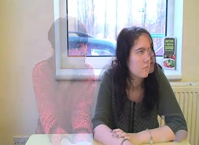
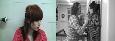
The audience said that up until the canteen scene they would not have known that the character turns invisible. The cross dissolve which we used in effective in realistically showing the audience that she disappears due to the necklace, but it also creative. However, this does not happen until 2 minutes into the film, so perhaps we could shoot another scene, or include the invisiblity effect earlier in the narrative, so that the audience's understanding is curren throughout the film.

2. Corridor Scene

This scene is imperative to the narrative of the film, as it allows the audience to see that the character is being bullied. From the audience feedbackwe found that they found it engaging, and easy to understand. Furthermore, they also felt that they could relate to the character, as bullying is a huge issue in most schools, and the issue was portrayed well. However, after viewing the film back, I feel that some of the shots could be reframed in order to engage the audience further, but also to make the film look neat, to match the continuity.

3. Toilet Scene


The audience found that this was the most effective scene in the films entirety at showing the invisibility effect. The majoirty of viewers said that they were "shocked" and "suprised" to see the character physically disappearing in the mirror. I am really pleased with the way in which we have edited this scene, as I also personally believe the continuity and effects used,such as the fade, work succesfully. However, I feel that the delay after the character disappears, in mid long shot, should be shortened, as I feel that the continuity could be better.

4. Pond Scene

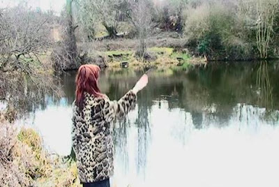
The ending, the audience said, was filmed particularly well, as the location is both eerie, but has a sense of beauty. The desolute area is also effective in isolating the character, and her emotions. The contrast and brightness has been purposely increased in order for the scene to have a mysterious element to it. Also, the over exposure enables the scene to be recognisable in the film. The non-diagetic music also enables the eerie effect to be enhanced, creative tension, and suspense.


Overall, I feel that after a few corrections such as framing, and lighting, the invisibility effect with look realistic, and the characters emotions can be succesfully shown.

Radio Trailer - Analysis


This is a radio trailer for David Tennant’s final episode in BBC1's Doctor who series. It was played on well known radio stations and helped produce a large audience for the final episode. It lasts 38 seconds and contains several common elements of radio trailers, these are;
Quotes from the show
Information of the show (where it’s shown, the times, and the date)
Music
Voiceovers

As soon as the advert the BBC jingle is played with a female voiceover telling you the date the show is been broadcasted “On new year’s day” and the channel it is on “On BBC one”. This straight away tells the audience when it is on, and telling the audience what channel it is on, pulling in more of an audience as they will know when it’s on and audiences that like BBC programmes.

On the advert it continues with quotes from the show, ones that draw in the audience like, “it’s the time lord” this will make the listener want to know what’s happened to him, or what’s going to happen to him. Also by referring to this character by ‘The Time Lord’ it hints at what the show is, and also what genre the show is, and could bring in audience who like the Sci-fi genre, as Doctor who is in the Sci-fi genre.
All throughout the piece non-diegetic music, in minor key, is played, it starts off quiet and low but as the advert continues, it gets louder and more drum beats are included creating more suspense as dramatic quotes are used from the show.
All of the quotes from the show are from male characters and even a few are from the Doctor himself. The female voice over from the beginning, is heard again throughout “The 10th Doctors final chapter” this give the audience some more information about what’s going to happen in the show, but also the line is dramatic and causes suspense, making a listener wanting to find out what happens to him.
As with most radio trailers they end with the main information about the show. The same female voice gives information about where the show can be seen and at what time. The music never stops, getting louder and more intense as the voice over speaks, also in the background there are still quotes from the show, making the ending more dramatic than the rest of the trailer, and this would make the listener want to watch it more, as the show seems to be full of drama and suspense.

Radio's can only project sound to their audiences, so therefore radio trailers have to engross a lot of interesting and captivating sounds. This trailer does this effectively as it uses voices, music and sound effects from the show. These make the trailer more interesting and appealing to listen to and will therefore help produce a larger audience.

Radio Trailer Script Idea

This is my idea for our radio trailer, it will last approximately 30 seconds.

Female voice: Sometimes your biggest wish can be your worst nightmare.
Minor music fades in
Voice 1: “Rubbbbbbyyyyy”
Ruby: “Just leave me alone”
Ruby: “why are you ignoring me?”
Ruby: "How could you do this to me?"
Male Voiceover: A Red Lizard Production, Film 4 presents...SHADOW...Coming to a cinema near you.
Minor music fades out

Wednesday, 9 March 2011

Film Poster Analysis


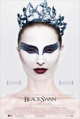
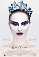
Black Swan is a 2010 American psychological thriller film directed by Darren Aronofsky and distributed by Fox Searchlight pictures. It is a successful film, costing only $13million to produce and by the end of February 2011 the box office gross was over $100million. One of the main reasons why this film did so well, and is still doing so well is the advertising campaign, the use of the posters, adverts and trailers, all in which are extremely effective. This particular poster is the most iconic poster of the film it was used in the majority of adverts including cinema posters, bus stops and billboard

The focal point of the poster or the most eye catching part of the poster is the girl’s eyes and eye makeup. The eye makeup of the girl is big and bold, because the design around her eyes is black, this contrasts with the rest of her face as she is all white, so the fact her eyes are black suggests that there is a dark side to her, also the shape of the design is like swans wings, another suggestion that the film has something to do with “Black Swans”. Also if you look a bit closer , and look into her eyes, you see that they are red, normally red eyes suggests someone evil or dark, so this further suggests that this girl isn't all good, or that something is going to happen to this girl. The rest of the image seems to be blurry, making it harder to look at forcing your eyes look straight to the girl’s eyes.

The whole image on the poster is of the main character in the film, thefact her face is painted in white suggests purity of this character. However like previously said her eyes are black, suggesting that she’s not as ‘pure’ as first thought, but also her lips are dark purple, also suggesting that this character has a darker/ deeper side to her. In the picture, the girl has her hair tied back in what looks like a tight bun, with a crown on her head; this suggests that she could be in a dance/ballet performance of something to do with royalty.

The background of the poster is white, this suggest purity and goodness, which again is contradicted by the darkness on the girls makeup.

The writing “Black Swan” is black and elegant, this suggests that it could be a film that seems to be about ballet, or another type of classic dance. However, the rest of the writing is pale purples, this contrasts with the black writing, but again makes the again makes the poster have a elegant, purity theme about it.

On the poster, it has the awards it has won already on it, this shows that audiences already like it,so may make other people go see it. It also has on the names of the main starring roles in it, these names are already popular movie stars adding to the selling point as fans of these stars will go see it. Also on the poster it has the month it is coming out on, so audiences know when they can go see it.
My Poster Design


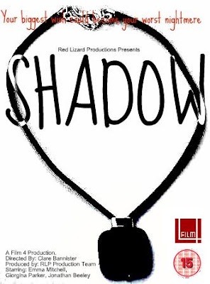
This is my design for a movie poster for our film 'Shadow'. I have used Paint and a programme called Picnic to create it.

Background:

I have used a plain white background for the poster as the main image on it is black and also this enables me to used dark colours for the text. Although most posters for a thriller would be black or dark colours, I feel that a white background in this case adds to the thriller as I edited it to make the whiteness help the main image to create shadows.

Main Image:

For my main image I have used the main prop in the film, a necklace, as it important throughout the film and as it is on the poster the audience will know that it will play an important part in the film, it also may help any viewer that didn’t understand the use of the prop in the film.
The image of the necklace is in all black, to add the feeling of suspense to it, and also make it seem scarier, also because of this I was able to add a slight shadow to it, which refers to the title of the film. Text:

For the tag line in my poster I used red, this was to make it stand out from the rest, however for my title I used black and white, which makes it look like a shadow, and as it is two toned it not only makes it unique but it makes it stand out on both the background and on the bit of image it covers.

Features:

On my poster I included

Film Four logo – the distributor
15 Certification – the age limit

Director, actors, and Production Company – film information

Tag Line.

Audience Feedback - Results

I have found from the research I have conducted on social sites MSN and Facebook that overall our target audience think that our film is very good and that it matches its set genre. There however a few changes that need to be made, these I will look at in another post.
Here I am going to look at audience and if our film appeals to our target audience effectively.

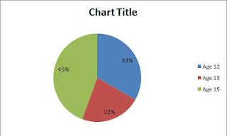
One of the questions I asked was, 'What age rating do you think our film would be?'
As you can see from the pie-chart, 33% of the people asked correctly though our film was a 12, unfortunately 45% thought that it was a 15, therefore we are going to have to try and make our film seem more like a 12, maybe by cutting any inappropriate language or shots.

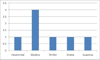
Another question I asked was 'What genre do you think our piece is?', above you can see the graph of answers. Most people thought it was a mystery not a thriller- however this is not too worrying as sometimes mystery and thriller films are very similar.

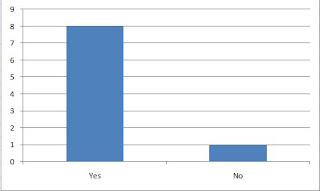
Finally I ask 'Do you feel that the story of the film is easy to follow', gladly only 1 person answered no. This is encouraging as we were worried that the storyline was a little bit too complicated, I'm glad that the audience followed it easily.

Overall I feel that we have attracted our target audience effectively, with a few tweaks and changes I believe that our film would be extremely successful at attracting our audience.

Audience Feedback

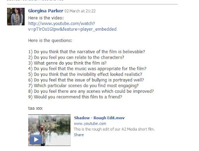
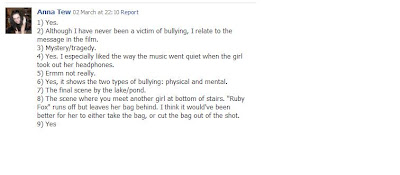
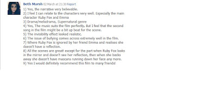
For my audience feedback, i thought the best way to get further feedback was to send a few of my friends the link to our film and then the feedback questions.

This is what i sent to the people willing to do it


These are my results:

Female, 18.


Female, 17.


Female, 20.


Female, 29.


Male, 18.


After look at the results, i found that there was a mix of different opinions, depending on the ages of the viewer, the younger viewers seem to feel that the mirror scene needs work on, whereas the older viewers feel that it should have said how long ago the bullying happened. Overall though the comments were good and the favourite scenes seem to be the canteen scene and the lake one.