Search for posts

Monday, 28 February 2011

Shadow Rough Edit - Analysis

After finishing our rough edit I am now going to explain which shots I feel we need to improve/change.

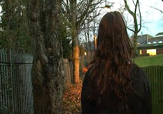
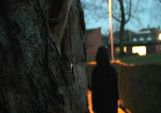
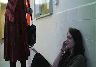
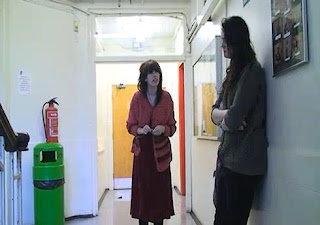
1)If possible I feel that we should re-film this shot (below left), as it was filmed earlier in the day, the lighting doesn't really match the atmosphere we were trying to achieve. It should match the shot (below right) filmed in the same scene, but later in the day as the atmosphere in this shot works really well
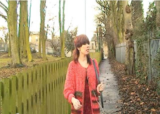
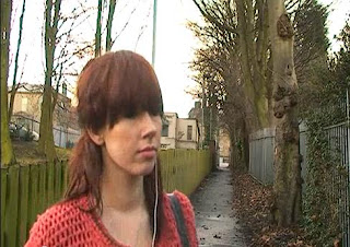
2) The music in this shot needs to be fixed, I like the idea of making the music change from non-diegetic to diegetic when Ruby removes her earphones. However when the music returns to non-diegetic the transition is too abrupt. I think it needs to be made a more softer and smooth transition maybe with a longer cross dissolve or fade.
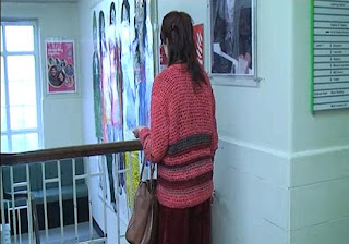
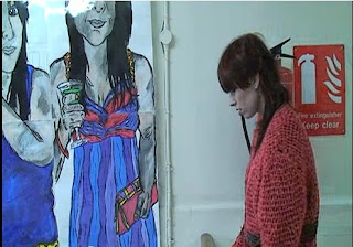
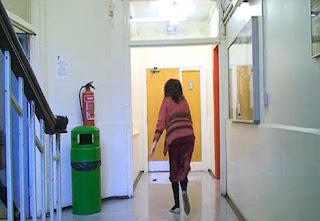
3) On this scene Ruby remembers an event that happened to her in the same location, however until the actual flashback this is hard for the audience to understand. Therefore I feel that we need another reference to the 'event', this could be other flashback shots or a collection of voices overlaid from the flashback.
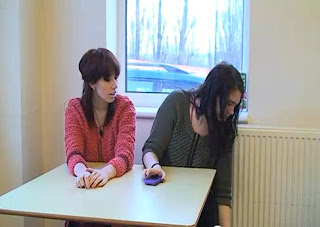
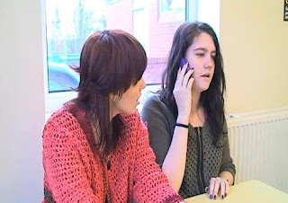
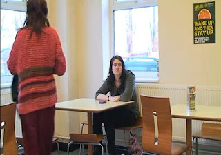
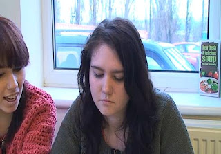
4)I would like to actually re-film this entire scene, I do think the idea of introducing a friend of Ruby's is a good idea as it is another good way to portray her invisibility. However I feel that the way it is written doesn't work as well as it could-having Ruby's mum call seems a weak way to show that Ruby is invisible.
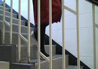
5) Again I would really like to re-do this scene, I believe that it could be filmed so much better and if done so would help enhance the story line. Also I feel that Emma's betrayal of her friend should be something a lot worse than just meeting with the bully seen earlier in the flashback.


Overall I am very happy with our fill so far, I think the majority of our scenes work well within the storyline. We have used a lot of effective shots including an eye-line and graphic matches. However I believe if we make the changes I have suggested above then our film could be even better.

Sunday, 27 February 2011

Radio Trailer Script Idea

This is my idea for our Radio trailer, it will last around 30 seconds. Start: Female voice: "All I ever wanted was to be invisible, but sometimes things done't work out how you expect them to" Music begins to fade in Voice-over: "Red Lizard productions presents Shadow..." Voice 1: "Rubbbyyyyy!" Voice 2: "Oi! she's talking to you" Ruby: "Just leave me alone!!" Voice 2: "Dont ever speak to me like that again, you are nothing!" Music drops to minor, becoming slower Voice Over: "Coming soon to your local cinema, Shadow." Music fades out Whipser: All I ever wanted, was to be invisible

Radio Trailer - Analysis


This is a radio trailer for the final episode in BBC1's Doctor who series. It was played on many well known radio stations and helped generate a large audience for the final episode of the series. It lasts 33 seconds and contains several generic elements of radio trailers, these are;
- Quotes from the show
- Show Information (including where its shown, times etc)
- Music

The trailer begins with a male voice over that tells the listeners where the show is being broad casted. "On BBC1", it is straight away advertising the channel and helping pull in an audience as people will watch the show if they recognize the channel.
After this the first quote from the show is played, there is no sound or music played along with it which adds to the blunt effect of the speech. "The Pandorica will open, silence will fall", this will help lure in the audience as they will want to know what the Pandorica is and what happens when it opens. Also the idea that silence will fall could imply an apocalyptic theme which will intrigue sci-fi fans (Doctor who falls into the sci-fi genre). An interesting technique used in this trailer is with the music: as the female voice says "silence will fall", the complete opposite happens and the music starts to build. The music is non-diegetic and in minor tone, it starts low and monotonous and builds, becoming more dramatic as the more vivid quotes are played from the show.
As the music builds there is a collection of voices from the show, their voices are panicked, hysterical and serious. Interestingly the majority of quotes are female which adds to the stereotypical idea of 'damsel's in distress', the voices which seem to be asking for help are all female. The quotes also make a reference to the protagonist of the show, the Doctor. This helps to establish the audience as when they hear 'Doctor' they automatically recognize the show.
The last quote of the collection is from the 'Doctor', he stereotypically plays the calm, collected and brave male. He is brought across as strong as his voice is loud and confident. He also draws in the audience by having the last thing he says 'come on', the listeners will interpret this as he is talking to them.
As with the majority of radio trailers they end with the main information about the show. The same male voice from the opening returns and gives information about where the show can be seen and at what time. The music also reaches its climax and drifts into the easily recognizable 'Doctor who' theme tune, again this will draw in fans of the show.

Radio's can obviously only project sound to their audiences, therefore radio trailers have to involve a lot of interesting and intriguing sounds. This trailer does this effectively as it uses voices, music and sound effects from the show. These make the trailer more interesting and appealing to listen to and will therefore help generate a larger audience.

Radio Trailers- Research

After researching and listening to several different radio trailers I have been able to pin-point the specific features they all include. Even though every radio trailer is different the majority all includes features from a list of fundamentals. These include;
-Quotes from film
These are generally the most memorable lines from a film, and are usually taken from the protagonist and antagonist of the film. They will be the same quotes used in cinema and TV trailers, and may also be used on posters.
-25 word pitch/General Overview
The trailer will probably include a general overview of what the film is about, this could be in the form of the films 25 word pitch. This is not a necessity however, you can keep the films plot a secret and therefore make your film more alluring.
- Director, Actors, Production etc
Usually radio trailers will include the names of people involved with the film. However this will only apply if it they are a big name. Only well known and top rate directors and cast names will be included as a ploy to attract fans.
- Distributor
Similarly to the director etc, if the film has a big name distributor they may be mentioned in the trailer.
-Tag Line
This feature would usually end the trailer, as a way of keeping the listeners interested. Also if it is short and snappy, as taglines usually are, it will be memorable and help attract an audience.

Radio trailers will also involve music and/or sound from the film.


Typically a radio trailer will last for around 30-60 seconds, depending on the type of film. Shorter films, and independent films will most likely have a shorter time slot due to funding and budgets, where-as larger names and hollywood blockbusters will be able to affored a larger slot. However you wouldn't necessarily hear a big blockbuster trailer on a radio, they usually stick to advertising o the internet, TV, and posters etc. Short, independent film which will be shown in local cinema will use local radio stations as a way of contacting the audience.

Sunday, 20 February 2011

Poster design ideas:

These are a collection of images that i feel should be included in our film poster:


Film Poster Design Idea


This is my design for a movie poster for our film 'Shadow'. I have used PhotoShop 7.0 to make a basic outline for our poster.


Background:

I have used a plain black backgorund for the poster as I feel for a thriller film it would work well. A dark background will help make any font/text stand out. The colour black also links to our title 'shadow', Shadows are stereotypically black and so it links. Also the them of our film is invisibility- therefore having a black backgorund could connote the idea that the main character is being pulled into darkness, and is actually becoming a shadow.


Main Image:

I believe that the protagonist of the film should be used as the main image on a movie poster, it helps the audience identify who the film is about before watching it. The main character of our film is a girl, and this is a steroetype of thriller films; having a 'damsel in distress', however unlike many other thriller films posters (e.g shutter island), there is no dominant male figure on our poster.
The image of the girl is only in outline, and is coloured grey. I feel this will help link to the theme of invisibility and give the idea that the girl is literally shrinking into the background.

Font:

I have used red for the colour of the title 'shadow' however i do feel that this oulc be re-thought. The colour red connotes anger, passion, love, death and blood and these themes arent really present in our film. I feel that the colour white works well on the other text as it stands out from the white background.


Features:

I have included several common features of movie posters, including:

- Age limit

- Distributor logo

- Information (actors, director etc)

- Tag Line

Thursday, 17 February 2011

Music Research

As we are soon going to be adding the music onto our film I have decided to research music that would be appropriate and effective in our piece. We are planning on using two main tracks in our film, on of each diegetic and non-diegetic music.

Non-Diegetic
The non-diegetic track is going to be used in our opening and closing scenes. It needs to set a sombre and moody atmosphere, and also add mystery to our film. The track would preferably be in minor key and use atmospheric instruments such as wind and stringed instruments.

Diegetic
The diegetic track is going to be used during the second part of our opening, it is supposed to be a track played off of Ruby's i-pod, it therefore needs to be upbeat and trendy as it would most likely be a popular and top-40 track.

Below I have found several pieces of music from well known thriller films:


This is the main sound-track song from the 2010 film Inception, this track would actually be perfect for our film but cannot be used obviously due to copyright reasons. I am going to try and find a piece similar to this, the deep moody and atmospheric sound is brilliant and sets the perfect mood for a thriller film. Also this track starts slow and fairly quiet and then builds into a fantastic piece of music.


This is the main soundtrack song from the 2000 film momento, I do really like this track but I don't feel it would work for our film. It sets a more depressing and pessimistic mood rather than mystery and tension.


This is the main soundtrack song from the 2010 film Black swan. This track would definatley not work in our film, it is in a too major key, in my opinion, and doesn't set the right type of atmosphere.
___________________________________________________________________
For the diegetic piece I am going to find something similar to songs that are in the current charts.

Thursday, 3 February 2011

Film Poster Analysis

Film explores the realm of imagination and the science-fiction action thriller film Inception, is an example of how film allows the audience to change their perception of the world in which they live in. the multi-layered plot requires each audience member to think throughout the entire movie. This is a movie that one unclear moment could affect the understanding of the entire movie; therefore it has been made the second best thriller film of all time, earning the gross revenue of $823,576,195.

As Warner Brothers were the distribution company for the successful film, their marketing strategy consisted not of only visual merchandising, and frequently visited websites, viral marketing but also included billboards and word of mouth. The iconic film poster for Inception portrays the illusion of a dream world, connoting the films themes successfully.

The idea of visualising a dream world can be presented through the background image, shown on the poster. The buildings are positioned to slant backwards, as the central road continues to run up the middle of the poster. This could be representative of what is to happen in the film, for example an everlasting journey, and could also symbolise the dream world in which the characters live. The long shot which is used to capture the image is effective, as the characters are positioned at the front of the poster, with the buildings and location in which they are, fading behind them. This could suggest that they are continuing on their journey, as their past life fades away. Although the long shot of the buildings have been edited to formulate a surrealist depiction of a city, the buildings look naturalistic, and therefore the shot looks more realistic; relating to the films narrative. Furthermore, the poster has a blue frame, which darkens the tone of the poster, and suggests that the films narrative is also dark and dangerous. This also adds an element of mystery to the film, increasing the audiences’ attention, making them want to view the film. The blue frame is also a paradigm of thriller films, as it is frequently used to depict the ambiguity and mystery in the narrative.
Another main sign on the poster is the 6 protagonists, featured in the central focus point of the poster. They all portray a tall, dominant stance, which suggests that they are part of a team, and connote danger, and action. This is a generic convention of thriller films, as the action plays an important part in the narrative of them. Furthermore, although all the characters are in a gaze facing the camera, they are not in a position facing another character. This suggests that although they are a team, they have their own identity, which immediately attracts the audiences’ attention, as they are curious as to who each character is, and their role in the storyline of the film.
The protagonist of the film is clearly presented, as he is stood directly in the central focus point of the poster, and is position further towards the camera, as a pose to the other characters. He is wearing a grey and black suite, which suggests that he is an important protagonist, and suites are used as a stereotypical costume of a dominant male character. Furthermore, he is holding a gun, which is a paradigm of the genre thriller, as it is associated with action, and fear. He is also stood at an angle, with half of the characters face shadowed. This could be an insight into the narrative of the film, as it suggests that he is a mysterious character with a split personality, and his controlling stance suggests he is powerful.
The title of the film is positioned in the centre of the poster, below the protagonists. The clear text is presented in capital letters, enabling it to be conspicuous and attract the onlooker. Furthermore, the colour red stands out against the dark background, again making it more prominent to the audience, but also the red and the dark coloured background are paradigms of thriller films. The colour red also connotes danger, which gives the onlooker an insight into the films narrative, and also enables them to see that it is a thriller film. The subtitle featured underneath the film quotes “from the director of the dark knight”, with “dark knight”, being in black, and bold. The onlooker is familiar that “the dark knight”, is an extremely successful blockbuster film, and therefore the expectations of the new film are high. This attracts familiar audiences, enabling the ratings of the film to be high.
Above the title, the poster also features a slogan “your mind is the scene of the crime”. This enables the audience to be associated with the poster, and empathises with the meaning of the quotation. “Your”, speaks directly to the public, which enables the onlooker to immediately feel a connection with the film. Furthermore, it gives an insight into the films narrative, and attracts them into watching the film. The very top of the poster features the infamous actor “Leonardo Dicaprio”, again in capital letters like the title of the film. This engages the audience’s attention, as they are aware that the quality of acting throughout the film will be high, and they may also associate the actor with other successful films, making them want to watch the film.
Finally, at the bottom of the film poster, the text “experience it” is presented, which allows the audience to believe that it is a phenomenon film, which is a must see. By using a quotation which suggests a superlative, this leads the audience to believe that is it primitive to view the film. I believe the film poster is successful, and efficient in selling the film, and attractive audiences, as it uses many paradigms of a thriller film to depict the genre, and stands out against other modern day thriller films.

Wednesday, 2 February 2011

Semiotics

"The science of decoding signs and sign-systems; as applied to visual art, since the 1960s. the treatment of images as a kind of language (with its grammar – the rules – and usage. the particular contribution of the artist) which can be deconstructed into its component parts."


Source: [http://www.google.co.uk/search?sourceid=chrome&ie=UTF-8&q=define:+semiotics]

During our film, we use a series of different effects to increase the audience's entertiainment. We used semiotics on numerous occasions in our film, the main occasion being the flashback scene.

In order for the audience to understand that a flashback was commencing, and that the narrative of the film had switched to the past, we decided to recolour the scene in black and white. The film also looks more eerie in black and white, and therefore suitable to use for the flashback of bullyig. We recoloured the scene using Final Cut Express then we added a fade transition between present day and the flashback. These two edits combined meant that the audience immediately knew that what they were seeing on screen took place in the past.

We also included a timelapse of the characters journey to college, where she is predominantly stood waiting for a bus, at the beginning of the film. This was to show the audience the passing of time, and because we edited the clip to have a variable speed which slows to a stop at the end of the video it gives the impression that things are returning to normal; time which was once moving at a fast rate has now slowed and gone back to reality.

Tuesday, 1 February 2011

Shadow - Rough Edit


Here is our first rough edit of our 5 minute short film, this is to be finalised, with excellent continuity.