
Tuesday, 1 February 2011
Shadow - Rough Edit
Here is our first rough edit of our 5 minute short film, this is to be finalised, with excellent continuity.
Saturday, 29 January 2011
Location Shots
Here are the final photos of the locations which we filmed at; apart from taking the photos on location, I also used Google Maps and Google Earth to plan out how long it would take to get to each location. It was also primitive to check the weather before each day we were due to film, to ensure that the equipment would also be safe.
LOCATION ONE: BARNSLEY COLLEGE AND SURROUNDING AREAS


------------------------------------------------------------------

LOCATION TWO: WILTHORPE, BARNSLEY (POND)
LOCATION ONE: BARNSLEY COLLEGE AND SURROUNDING AREAS


------------------------------------------------------------------
LOCATION TWO: WILTHORPE, BARNSLEY (POND)

-----------------------------------------------------------------
Thursday, 27 January 2011
Film poster analysis


For my film poster analysis, I am going to look at 2 posters. One is 2007 American thriller Disturbia starring Shia Lebeouf, the other is 1998 conspiracy thriller Snake Eyes starring Nicolas Cage.
The main focus presented in Snake Eyes is the title and the lead actor, the title is presented in a big font colored white on a darker background, making it stand out against the rest of the poster. The scratches on the font indicates damage and violence.
The actors second screen name is also in a big font and colored green to stand out from the rest of the poster, indicating his importance in selling and promoting the film. The name of the film is also played on, being called snake eyes there is a focus on Nicolas Cage's eyes, strengthened by the films tag line 'believe everything except your eyes'.
The main focus in Disturbia is the main image of the leading actor using binoculars to spy on someone, namely the love interest of the film who is shown in the Len's of the binoculars, as well s the films villain the murderer Mr Turner. Its indicated he is some kind of spy by the binoculars he has in his hand.
The black and white colours combined with the shading on his face indicates darkness, secrecy and perhaps a hint of seclusion and isolation due to the house arrest the character is experiencing throughout the film. There isn't a lot of emphasis on the actual name or identity of the leading actor indicating he isn't a Hollywood blockbuster actor. The tag line to the film 'Every killer lives next door to someone' references the fact that the murderer Mr Turner lives near him.
Monday, 24 January 2011
Film Poster Analysis
 Shutter Island is a psychological thriller released in 2010. Based on the novel, of the same name, by Dennis Lehane, it was directed by Martin Scorsese and distributed by Paramount Pictures. It was quite a successful film, costing only $80 Million to produce; they nearly tripled that in the box office.One of the reasons this film was so successful was its excellent advertising campaign, the posters and adverts used to sell this film were extremely appealing and effective.
This particular poster is the most iconic poster of the film it was used in the majority of adverts including cinema posters, bus stops and billboards. It has also been used as the films DVD cover.
 The main focal point of this poster or the most eye-catching part is the bright red title ‘Shutter Island’. It is positioned centrally, but dropped down below the main image. It has a ‘scratchy’ ‘messy’ design and the colour red is a stereotypical thriller film colour. The colour red can connote, anger, death, blood, love and many other themes that are present in these types of films. The title is also written in capital letters which makes it more eye-catching to the audience. The rest of the text on the poster is written in white, this contrasts with the red title, making it just as eye-catching but also submissive to the main title. The colour white stands out well against the dark background.
The main image of the poster is a shadowed face of a man; he is holding a match in his hand which is providing the light on his face. The idea that he is shadowed creates the idea  that his character is hiding something, and has a sinister side. It could also give the impression that the character has two side to his personality, and as his face is half light and half dark- it could represent a good and evil side. He seems to be looking at something in the gloom as his eye is looking right off of the poster. This creates a sinister feel to the film, and produces the idea that this man has found something disturbing hiding in the dark. The man’s face also seems to have a black and white tint to it, and the only bold colour is seen on the flame and his eye. This gives his eye a sharp edge, and also again creates a disturbing psychotic feel. It is a common theme in thriller films for the protagonist to be man, and the main female to fall into the role of 'damsel in distress', however on this cover it seems that the main hero is in distress and may be the one who needs help/saving.
that his character is hiding something, and has a sinister side. It could also give the impression that the character has two side to his personality, and as his face is half light and half dark- it could represent a good and evil side. He seems to be looking at something in the gloom as his eye is looking right off of the poster. This creates a sinister feel to the film, and produces the idea that this man has found something disturbing hiding in the dark. The man’s face also seems to have a black and white tint to it, and the only bold colour is seen on the flame and his eye. This gives his eye a sharp edge, and also again creates a disturbing psychotic feel. It is a common theme in thriller films for the protagonist to be man, and the main female to fall into the role of 'damsel in distress', however on this cover it seems that the main hero is in distress and may be the one who needs help/saving. The other main i mage of the poster is that of an island, it is positioned in the centre of the poster. This shows that the image is important as it links to the title of the film ‘island’. The island also seems to have an ominous white glow around it, making it stand out from the dark background.The images on the poster are set on a black background, a paradigm of thriller films; the island is also set on a stormy sea, and on all the poster there is heavy rain. Storms are a generic convention of this genre of film and by using it as the main design on the poster creates the idea of danger and anger. It could also connote the idea of being trapped and isolated; being on an island in the middle of a storm will mean that you are cut off from other people.
Set near the top of the poster, to the right is the films tagline; ‘someone is missing’, it is set on top of the man’s face, above the flame of the match. This is very clever as the audience will probably notice this last, and therefore it will create a new interest for the film. Als o by using the colour white on the text means that the tagline does not draw attention away from the bold red title.The tagline also links to the image of the man, the word ‘someone’ creates confusing about who is actually missing. The audience may think that the man has found the missing person, or as he seems to be fading into the background- he is the one that is actually missing. This will hook in the audience and make them want to watch the film.
 mage of the poster is that of an island, it is positioned in the centre of the poster. This shows that the image is important as it links to the title of the film ‘island’. The island also seems to have an ominous white glow around it, making it stand out from the dark background.The images on the poster are set on a black background, a paradigm of thriller films; the island is also set on a stormy sea, and on all the poster there is heavy rain. Storms are a generic convention of this genre of film and by using it as the main design on the poster creates the idea of danger and anger. It could also connote the idea of being trapped and isolated; being on an island in the middle of a storm will mean that you are cut off from other people.
Set near the top of the poster, to the right is the films tagline; ‘someone is missing’, it is set on top of the man’s face, above the flame of the match. This is very clever as the audience will probably notice this last, and therefore it will create a new interest for the film. Als
 o by using the colour white on the text means that the tagline does not draw attention away from the bold red title.The tagline also links to the image of the man, the word ‘someone’ creates confusing about who is actually missing. The audience may think that the man has found the missing person, or as he seems to be fading into the background- he is the one that is actually missing. This will hook in the audience and make them want to watch the film.
Friday, 21 January 2011
Film poster research


I have researched and posted these film poster onto our blog because they all have elements of our genre incorporated into them, relating to our film. For instance, they all have deep senses of mystery in them e.g. in Snake Eyes its a conspiracy theory, Shutter Island its the missing patient, in Psycho it's the identity of who is killing people, in Disturbia it's the motives and actions of the man living across the road, Robert Turner and in The Blair Witch Project its whether the Blair witch is real and the disappearance of a friend.
Tuesday, 21 December 2010
Filming on location - Safety
PUBLIC FOOTPATH - ACT 1, SCENE 1


Difficulties we encountered- The path was very wet, and contained a lot of dead, autumn leaves, and in order for the shot to work accordingly, we had to remove these. We were also quite short of time, and we were pressured to film the day scene, before it got too dark.
COLLEGE TOILETS - ACT 2, SCENE 2 


Difficulties we encountered - The only problems which we encountered whilst filming in the toilet were the woman who came into the location whilst filming, which delayed our filming time, and the confined space, making it difficult to film long shots.
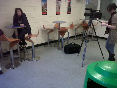
CANTEEN SCENE: ACT 2, SCENE 1

Difficulties we encountered- Through the duration of filming the canteen, the most difficult issue which we dealt with was the noice in the background. Although we wanted the scene to be realistic, and consist of some noise, we didn't want it to be too loud, so that the cast would not be heard. Therefore, we asked the students in the canteen to be respectfully quiet whilst we filmed, and they happily obliged.
POND SCENE: ACT 2, SCENE 3


Difficulties we encountered -The banking was very steep, and difficult to maneuver the tripod and camera on, as they were unlevel, damp and muddy. Therefore we had to be careful not to let the tripod sink into the ground. Also, the rafts which we filmed the character Ruby on, were very small, and therefore not only was it difficult to film the close up shots of her, but also was dangerous for both the cast and crew, as they were so small, and so close to the pond, therefore we all took extra care in handling the equipment, and making sure everyone filmed sensibly.
Wednesday, 1 December 2010
Music Research
In order for the film to be as effective to the audience as it can be, I decided to research thriller film music, as music plays a huge part in the continuity of a film: it is used in ours to build tension, and suspense. But we also need music to explore characters feelings and emotions.
This first track which I found is particularly effective in creating suspense and tension:
The music is appropriate for the genre, but will also be more attracted to our target audience of teenagers. A similar non diagetic music track could be used in the opening of the film, where the protagonist is stood at the bus stop, as I think it will fit in perfect syncronisation with the fast past editing. As the track progresses, the major key volume of the music then increases, to sudden pangs, this is interesting as it suggests that the action in the music is building up, and it increases the heartrate. We need a similar soundtrack in our film, as we want the audience to feel the characters emotions, but also if the music increases the audience's heartrate, then it is succesful in engaging them to the film.
Subscribe to:
Posts (Atom)